Embracing Nature & Living Design
When building a home, environment is usually considered. You don’t build light and airy home on stilts with minimal heating on a mountain and you shouldn’t build a home with large timber beams and a stone fireplace on the beach. However, that’s what Thomas Richard Kelly saw when he walked into a home in Osprey, Florida. “It wasn’t originally designed at all to optimize its living potential. There was a massive stone fireplace right in the middle of the view, and heavy drapes on the windows blocking most of the natural light.” Despite a vista that most would be envious of, right on the intercoastal waterway in sunny Sarasota county, the home was closed off from its surroundings, creating an almost cavelike experience within the main living areas. Kelly’s biggest task? Maintaining structural support while eliminating the heaviness that pervaded the home, leaving a beautiful, liveable design in its place.
Living Design
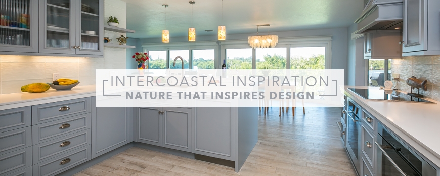
The homeowner is an avid cook who enjoys entertaining guest, so Kelly wanted to open the living spaces to include the kitchen, in effect creating a living design that allows the kitchen be incorporated into social activities. Large amounts of renovation were required to accomplish this, including removing a large part of the front of the home, tearing out the ghastly fireplace, and creating new structural beams and a wall of windows for the ideal vista. Upon entering the home, guests are now treated to a gorgeous panorama right from the front door to the water.
Part of the host’s entertaining and cooking desires was ample storage space. Despite having copious amounts of cabinetry, both Kelly and the homeowner felt that those should be set aside for tableware, special cookbooks, and decorative kitchen accessories, and opted to create bulk storage in an easily accessible pantry. “We incorporated reeded glass doors into the pantry door to open up the design, and matched it to doors we placed within the cabinetry.”
Color Conversion
In planning, the homeowners and Kelly, of Thomas Richard Kelly Design, decided to focus on pulling the colors, light, feeling, and emotions from the surroundings and into the home. “We decided on orienting our space towards the water,” Kelly stated, and it shows in the palette created for the kitchen, dining, and living areas. Beautiful cabinets in a soft grey-blue from Benjamin Moore, aptly named Shadow Gray, mimic the ever-changing colors of the water’s graceful ripples.
These ripples are also mirrored in a beautiful, textured glass backsplash, but Kelly didn’t stop at merely waves, going above and beyond with the incorporation of natural colors and textures into several other elements of the kitchen design. While the previous flooring would have clashed with the light color palette of the newly designed space, the wood grain porcelain tile they selected blends harmoniously. “We actually brought the final tile choices down to the beach and matched them to the sand,” stated Kelly, “we wanted something natural that wouldn’t compete with other elements in the kitchen and living areas.”
When selecting the countertops, Kelly specified that the wrong decision here would also have “mucked up the whole job”, so they chose a fresh, clean color of white Caesarstone quartz. It allows the other colors and design elements in the kitchen to speak for themselves. The homeowner, happy with the selection, said the countertops reflect the beauty of the cumulus clouds that float by on bright, sunny days.
Finishing Touches
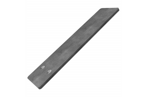
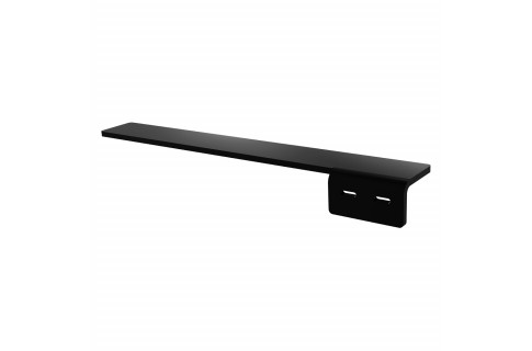
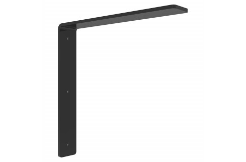
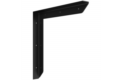
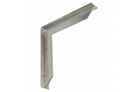
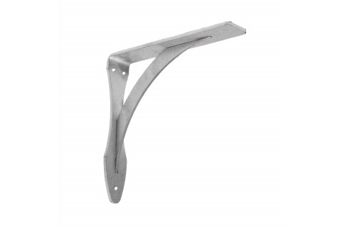
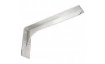
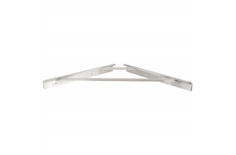
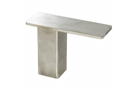
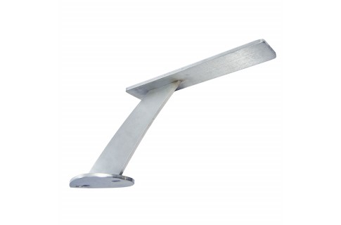
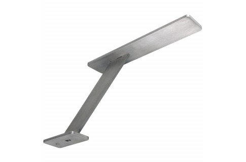
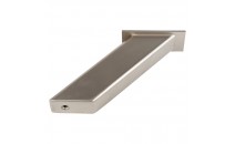
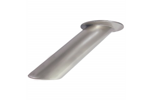
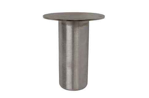
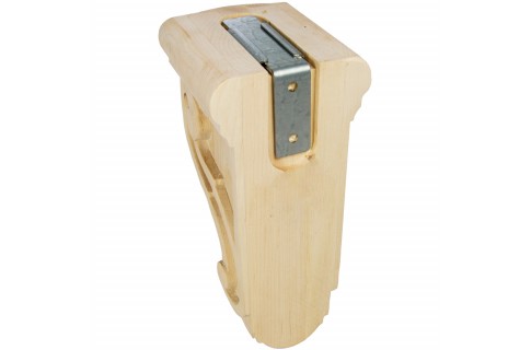
The dining room, adjacent to the kitchen, is separated only by a high breakfast bar. “The client really wanted this option, which is why we had to tackle the issue of support.” The dreamy air of the kitchen could be diminished by something clunky or bold, so Kelly chose to go with Federal Brace’s Liberty Support, which added invisible structural support without creating any added bulk. The dining room’s premier light fixture is a subtle chandelier, featuring seashells and alabaster, resembling the seashells that routinely wash ashore. The table below is imported French, made of blue glass and providing a clean silhouette that provides little obstruction of the view from the kitchen.
Given the homeowners’ talents in the kitchen, the utmost importance was given to the appliances that would bedeck their space. “They wanted the best, and that is exactly what was specified,” Kelly expressed. A full stainless steel suite of Sub-Zero and Wolf was integrated into the cabinetry, with a wide 48” Sub-Zero refrigerator, multiple convection ovens, and a base cabinet-installed drawer microwave. Each appliances is merely inches away from the other, allowing for swift, easy transitions during preparation or cooking.
Kelly couldn’t be more ecstatic about how the project looks. His positivity and excitement were evident from the minute he began discussing the renovations that were to be completed and their eventual finished beauty. Not only is his genius evident in the gorgeous photos of the remodel, but in the way his clients now enjoy their beautiful, new space. “They are now surrounded by beauty,” stated Kelly, author of the newly released Living Designs, an invaluable resource on interior design in the modern home. “They are truly living within the living design.”
